Making keyboard-accessible interactive elements
Why it’s important
Applications and websites can usually be controlled in different ways. Like using a mouse, keyboard, touch screen, or even eye trackers or voice control software. Still, it's common for designers to build pages and apps with only the mouse considered. This can leave out people who can't use a mouse because of cognitive or physical disabilities. So, it's important to think of all the other ways a user can control a page to build an accessible website or app. In this article, we're talking about the keyboard.
Native interactive elements
Interactive elements are things like:
- Buttons
- Links
- Tabs
- Accordions
- Form fields
Most of these components can simply be used without any heavy lifting of custom JavaScript or excess ARIA, by using modern, native, and semantic code.
In HTML:
<button type=’button’><a href=’#’>-
Important note:
<a>without a‘href’attribute will not be interactive and receive keyboard focus, as without this attribute, it is no longer considered a link.
-
Important note:
<details><select><datalist><input type=’x’>
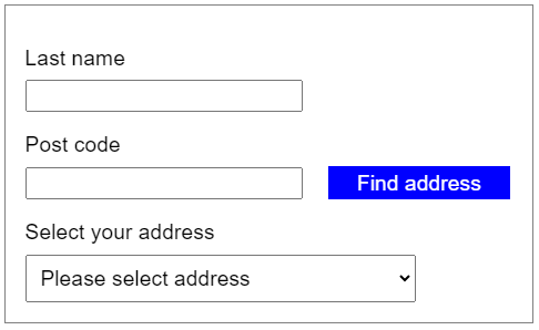
An example of a design using inputs, selects and buttons:
What you shouldn’t do
Even with built-in elements existing, there are many examples online of where developers have tried building a custom version. These elements may look like they should behave like the native version, but “under the hood” in the code, are actually elements without the necessary semantics for assistive technologies.
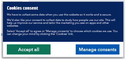
The example below has <span> elements that are styled to look like buttons. Visually you wouldn’t know this. But when trying to interact with them either via the keyboard or assistive technology, you’d think they’re broken:
As <span> elements aren’t interactive (by default), developers need to understand and make sure all native behaviour is considered - including keyboard accessibility. In this case, the “Accept all” and “Manage consents” buttons can’t be accessed with the tab key on a keyboard (which moves through the interactive elements of a page). This excludes users that rely on keyboard control, especially those with severe mobility impairments.
It's also important to note that only interactive elements should be in the tab order of the page. We shouldn't give focus to non-interactive elements on a page as a user won't expect it and may get confused.
How to get it right
IMPORTANT: Native interactive elements automatically get focus and can be interacted with by keyboard users. Whenever you can, it's best to use these elements to trigger a function or get input (and style them as needed). Buttons can be triggered by using the Space key or the Enter key.
Custom components
If you need to develop a custom component (based on a <div>, <span>, etc) there are steps you'll need to take to make sure they’re accessible to all users:
- For people who can see, make sure the thing you want them to click on looks like it can be clicked. It could have a border, a different colour, or an icon.
- Include the component in the tab order by adding the attribute tabindex="0". A value of 0 will place the component in the tab order based on its surrounding content. We do not recommended overriding this by using a positive value, as that would take the component out of the natural focus order of the page.
- Give the component the appropriate interactive role. As an example, for a button, you would use the ARIA attribute role=”button”. This helps assistive technologies understand the role of the component, how it should behave and who it should be used.
-
On the component, In JavaScript, use a “keyup” event listener to
listen for the keys that should respond to user input (e.g. Enter,
Space, Alt, Arrow keys etc). Make sure you use the “click” method to trigger an action, select an option, or submit
data. To learn more about keyboard behaviour, go to the ARIA Authoring Practices Guide (APG)
 .
.
- Whenever you can, we recommend sticking to the regular behaviours of native components. For example, when moving between options, selecting an option, or triggering a button or link. This way you're not setting your user up for any unexpected challenges, and they can interact as they would usually do on other websites and apps.
- Your user shouldn’t be able to focus on a component if you’ve disabled it. You can do this by setting the tabindex attribute value to -1. When you enable it again, you can toggle it to 0.
Here’s what the cookie consent example we saw earlier would look like once fixed:
HTML
        <span role="button" tabindex="0"
        id="accept"

        class="confirm-button button-primary"

        onclick="cookie_accept();">

        Accept all</span>
JavaScript
function cookie_accept() {// Code that accepts the cookie goes here.
}const btn = document.getElementById(“accept”);
btn.addEventListener(“keyup”, (e) => {
e.preventDefault();if (e.key === “Enter” || e.key === “Space”) {
btn.click(); }}But we could make this simpler and less prone to mistakes if we did:
<button type=”button” id=”accept” class=”confirm-button
        button-primary” onClick=”cookie_accept();”>Accept all</button>
JavaScript
function cookie_accept() {// Code that accepts the cookie goes here.
}// Nothing else needed to handle the keyboard events!


